Role
Brand Designer
Duration
2 months
Tools
Figma Design
Type
Brand system
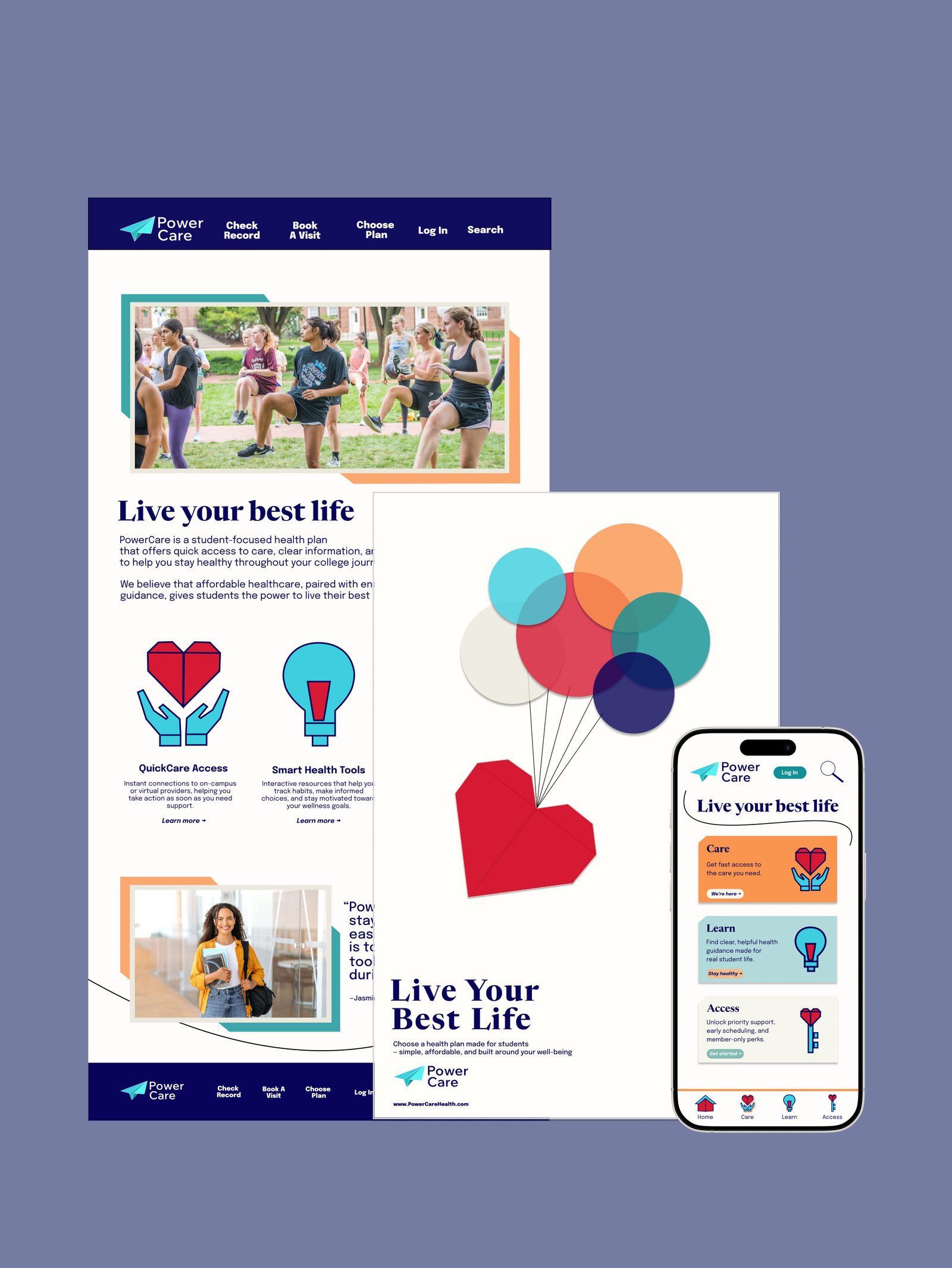
PowerCare brand system: webpage, poster, and student healthcare phone app
Scroll

A healthcare brand
for college students

PowerCare was designed to bridge the gap between complex healthcare systems and the fast-paced lives of students — a visual-first experience that prioritizes clarity and ease of use.

PowerCare across a landing page, Live Your Best Life poster, and mobile app

Context

Overview

PowerCare is a healthcare brand experience designed for college students. Working from a predefined brand strategy, I developed the visual identity and user-experience journey across a promotional poster, a landing webpage, and three mobile app screens.

My Role

I was the brand designer — translating story, audience, and personality into a mark, posters, web, and a mobile path focused on high-impact design that simplifies the way to wellness.

Timeline

About two months in 2025, from brand-strategy boards and poster sketches through a cohesive identity on print and digital touchpoints.
Project brief

The ask

How might we inspire college students to feel energized, supported, and confident in managing their health — without the usual fog of university healthcare?

The given strategy was clear: “We believe that with good health, anything is possible.” PowerCare is a health plan exclusively for students, built to make access and information feel easy enough to use.

The challenge

Complex medical information and campus bureaucracy. Students need a path that feels calm, not like another portal.

Personality

Active, inspiring, empowering — energetic enough for student life, without looking like a hospital or a gym ad.

Design

Care, Learn, Access

The identity streamlines healthcare into three pillars so a student can scan a poster or a phone and know where to go next.

  • Care — get fast access to the care you need, without hunting through a directory.
  • Learn — clear, useful health guidance written for student life.
  • Access — priority support, early scheduling, and member-only paths.
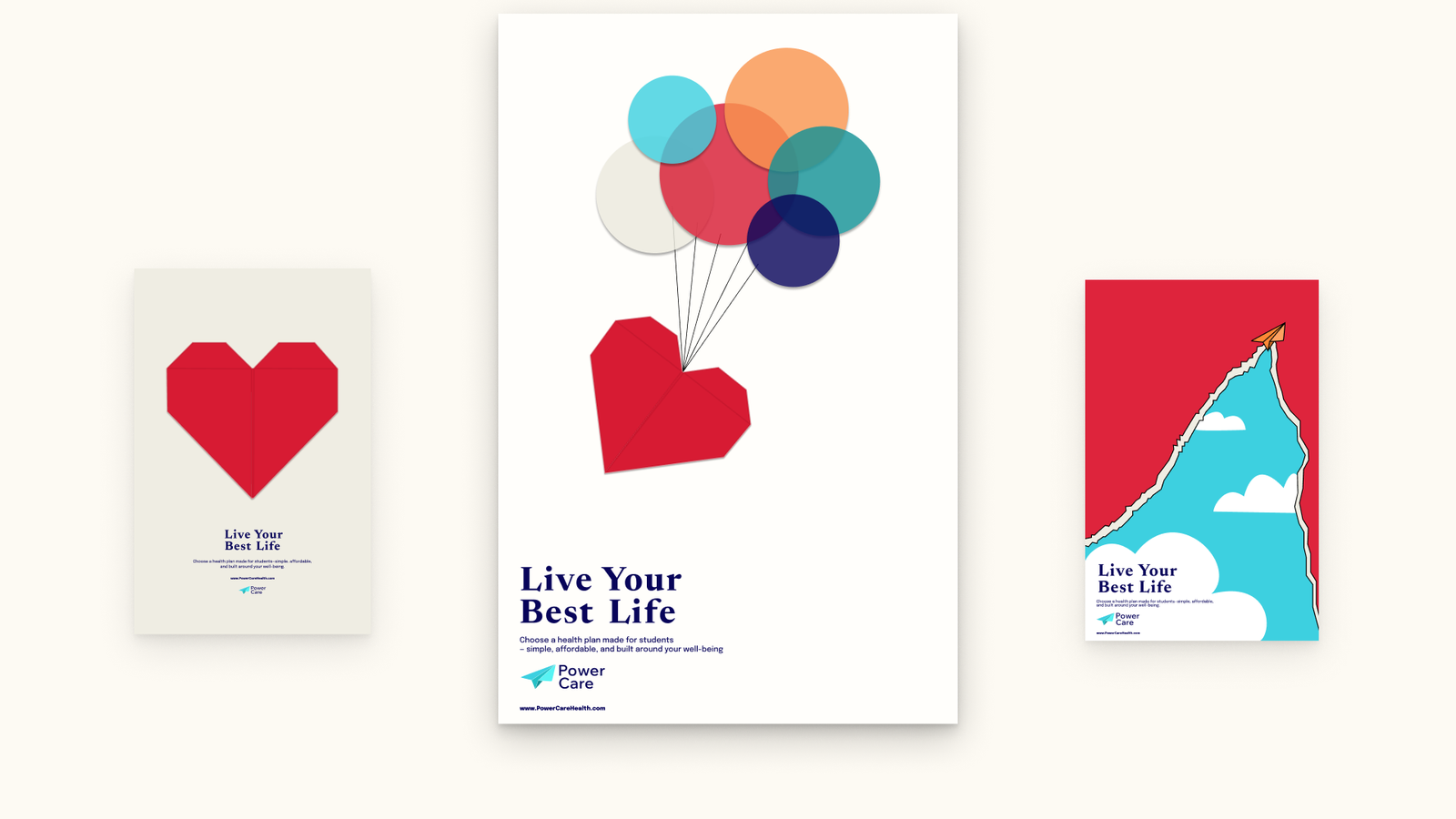
  • One mark, many surfaces — a paper-plane logomark and origami-heart posters so the brand is recognizable from a hallway flyer to the app home.

A cohesive visual system across touchpoints is there to build recognition and trust on sight — replacing the typical confusion of university bureaucracy with a sense of calm, guided control.

Poster set, logomark, and personality moodboards.

Process

Strategy on the wall first

Story, audience, and personality were handed over as a board: college students who should feel energized, supported, and confident. I used that as a constraint, not a slide to decorate — every mark had to read as active, inspiring, and empowering.

Posters before pixels

I thumbnail-sketched “Live Your Best Life” as a series of verticals — plane, balloons, folded heart — then took the origami language into the final posters and the app’s three pillars.

Result

One identity, three doors

The work landed as a poster family, a landing page, and a three-screen mobile path — Care, Learn, Access — under one paper-plane mark. Centering peace of mind was the point: a lower barrier to student wellness.

[TODO: add result metrics for PowerCare]

Takeaways

What I’ll carry forward

Honor the strategy

The personality words were a brief, not mood-board captions. If it didn’t feel active, inspiring, or empowering, it didn’t ship.

Sketch the campaign

A sheet of vertical thumbnails found the folded heart and the plane faster than jumping into a high-fidelity poster.

Three doors, one brand

Care, Learn, and Access let a hallway poster and a phone home say the same thing without repeating a paragraph of policy.

Final PowerCare poster set on a cream field
Next project Lilo